
Asset management
6 months
Transforming the Investment Institute to drive engagement and interest in funds
Financial Services Forum Award for Best Website Transformation 2025

Overview
AXA IM is a global asset manager dedicated to helping their clients build their financial futures. To strengthen their position as a trusted source of investment insights, AXA IM launched the Investment Institute. The platform showcases thought-leadership, highlights expert authors, and supports the firm's broader strategic objectives.
AXA IM faced several user experience challenges, including confsuing navigation, limited content pathways, and low subscription growth. Users struggled to differenciate between insight areas, resulting in high drop-off rates, and articles lacked clear links to strategy and product pages.
To address this, we worked with AXA IM to implement a series of targeted improvements. We simplified navigation and filtering, redesigned article pages with strategic promotions, introduced expert-led author pages, and added prominent subscription touchpoints to drive engagement and support business goals.
Main activities
- Usability Testing & Product Validation
- User Behaviour & Analytics
- Vision Setting & Validation
- Roadmap Development & Prioritisation
- Business Strategy & OKRs
- Market & Competitor Analysis
Challenges
AXA IM's Investment Institute users struggled to navigate and differentiate between insight areas, leading to high drop-off rates. There was minimal traffic flowing from aricles to fund-related content, and subscription growth remained stagnant due to a lack of prominent sign-up opportuntites. Our task was to streamline the user experience, improve content pathways, and drive engagement across touch points.
Implemented strategic design improvements
We restructured the site and introduced key design changes to create a more intuitive experience. Simplified navigation, smarter filtering, and curated content blocks made discovery easier.
Article pages were optimised with strategic promotions to guide users further. Author pages highlighted expertise with bios and multimedia content, while additional subscription touchpoints encouraged sign-ups throughout the experience.
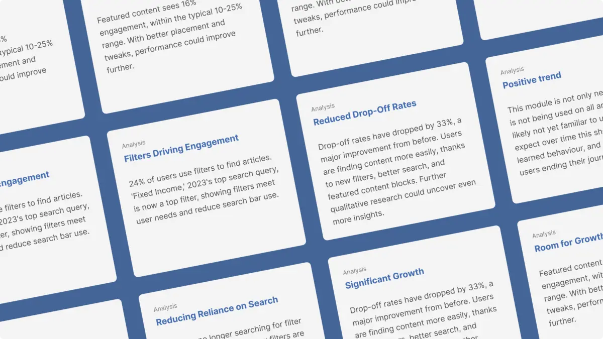
Identified key user pain points through data analysis
By analysing user behaviour, we uncovered core challenges affecting the investment institute experience. Overlapping insight areas created confusion and high drop-off, while a complex structure and limited filters made article discovery difficult. Minimal links to related content reduced onward journeys, and low-visibility sign-up options hindered subscription growth.
Solutions
Centralised insights under the Investment Institute
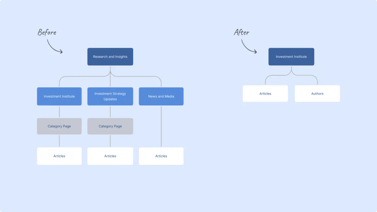
Initially an extension of the Research & Insights section, the Investment Institute was restructured to become the primary destination for all insights content. By consolidating relevant material under one central hub, we significantly imporved the user journey, leading to a 49% decrease in drop-off between landing and article pages.
Improved article discovery with filters, search, and content promos
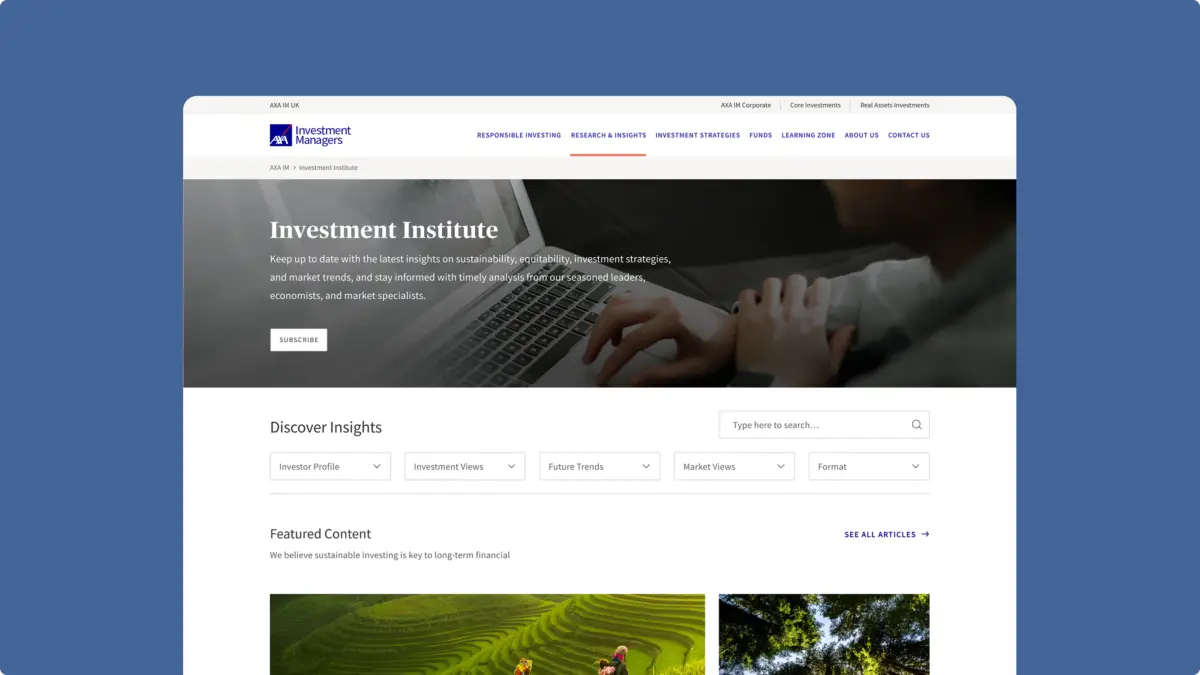
The article routing page was redesigned to improve both search and browsing experiences. Key updates included a new filtering system and curated content blocks, allowing site managers to highlight important articles. This approach boosted user engagement, reduced drop-off by 33% and saw 24% of users engaging with the filters and 16% interacting with the curated content block.
Enhanced article engagement and navigation
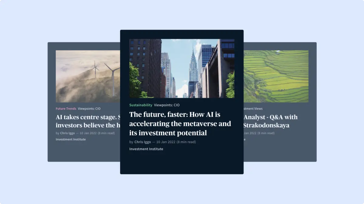
We added key takeaways and article summaries at the top to improve engagement and highlight important insights right away. A dynamic side panel now drives traffic to AXA IM's strategy and product pages, while an improved related articles module makes exploring content easier. These updates led to a 28% reduction in drop-off rates and an 8% increase in users visiting fund pages.

Strengthened credibility & engagement with redesigned author pages
To boost SEO and increase expert visibility, we redesigned the author pages to enhance credibility and improve content discovery. Each page now included a detailed author bio, a curated list of their latest articles, and categorised tags for easier navigation. As a result, 9% of users who view articles also visit author detail pages, and 38% of users on auhtor pages interact with tags or media content.
Boosted subscriptions by integrating more touchpoints
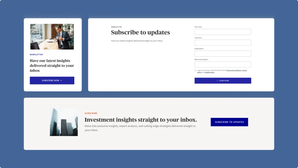
To drive subscription growth, we introduced a scrolling side panel promotion and an embedded subscription form at the bottom of articles. These non-intrusive, seamless enhancements provided users with more opportunities to subscribe, increasing engagement and data capture. As a result, subscriptions grew by 207% from 2023 to 2024, driven by improved visibility and user-friendly sign-up options.
Redesigned main navigation to enhance the Investment Institute entry point
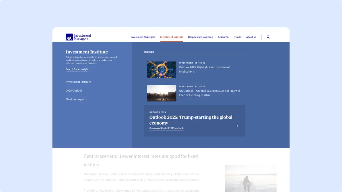
We redesigned the Main Navigation drop-down to improve content discovery, making the Investment institute more accessible and surfacing key insights through the "Discover" section. We also introduced a new download touchpoint, offering users an easier way to access important documents. These changes contributed to a more streamlined and engaging user experience.
Summary
The enhanced AXA IM Investment Institute user experience has significantly improved engagement and subscription conversion, and traffic to fund pages.
By refining the user experience, we achieved a 33% reduction in drop-off rates on the landing page, a decrease from 55% to 22%, and saw a 207% increase in subscriptions year-on-year. Additionally, there was a 9% increase in users viewing product pages from articles, demonstrating the impact of our improvements.
Pattrn helped us reimagine how we present our insights combining editorial storytelling with a more intuitive user experience. The result has been a marked increase in engagement, a clearer connection between our content and the value of our funds, and recognition through the Financial Services Forum Award for Best Website Transformation.
 Tom Roberts Senior Web Experience Manager, AXA IM
 Project impact (anticipated)
33% reduction in drop-off rate on the landing page
By optimising the user experience and streamlining navigation, we reduced the drop-off rate from 55% to 22%, encouraging users to engage more deeply with the content.
207% increase in user subscriptions year-on-year
Through improved visibility and seamless subscription touchpoints, we drove a significant increase in user sign-ups, reflecting the effectiveness of our design enhancements.
9% increase in users viewing product pages from articles
By integrating strategic links within articles and improving content flow, we successfully guided more users to explore related product pages, boosting interest in AXA IM's offerings.